|
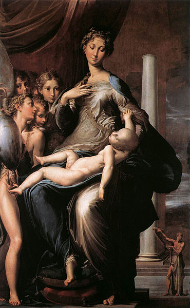
Madonna with the Long Neck
by Parmagianino, 1534-40 |
lately i've begun to experiment with stretching type.
i know . . . i know . . .
it all started this summer when i read
a piece by michael beirut about "the new brutalism" on design observer. in the article he wrote about a german magazine, 032c, in which the designer had, sin of sins, used stretched type as a major component in the layout. the article went on to discuss "the new brutalism" and other examples of ugliness in design. in the end, beirut was understandably hesitant about the whole trend.
after reading the article i decided to keep my eyes open for examples of "the new brutalism" and, sure enough, i've seen it popping up. in the light of the 80s revival of the past few years it hardly seems surprising.
i can't say that i disagree with beirut's hesitation to get on board with what was then a burgeoning trend. as he said in the article, stretching type is perhaps the last taboo in design. it's amateurish. it's disrespectful to the original design. it's just ugly, right?
yes, it sort of is.
 |
Entombment
by Jacopo Pontormo, 1528 |
but then i thought of the mannerists.
for the uninitiated: "mannerism" was a period in art that came just after the high renaissance. it was characterized primarily by odd, unsettling proportions and poses, surreallist religious/allegorical imagery, and dramatic settings. if you look at the two paintings at the left you'll see these characteristics present.
in the madonna painting you'll notice her neck, but also the bizarrely elongated body of the christ child as well as his pale, deathly look, the strange perspective with regards to the figure in the background (who's doing what, exactly?) and also the woman's very long leg at the left. in addition, the setting is somewhat oddly lit, giving the whole scene a nightmarish quality, and the pillar in the background is supporting nothing, it's just there, and there are several points at which the perspective creates some damn near impossible poses (the madonna's legs).
in the entombment what's immediately striking is the lighting. it's unnatural, as though the scene is being played out on a stage. the figures in the painting, though vaguely descending a rocky hill, appear more stacked that in perspective. the circular structure of the composition keeps the eye moving around, unable to really rest on anything in particular. also of interest are the figure in the foreground and the figure supporting christ's torso. the kneeling foreground figure is bent at the back in an uncomfortably unnatural way, and the body of the figure in blue has a freakishly long torso.
in both of these paintings we've observed that the artist made particular stylistic choices which are contrary both to nature and to conventional wisdom as to how the human body should be portrayed. given the virtuosity of the paintings it's safe to assume that these artists did not portray their subjects in these unnatural ways because they didn't know any better or lacked skill; they chose to do it that way. the "why" isn't exactly clear, but it was a stylistic choice that, for better or worse, makes a distinct impression. though the style can be jarring, there is an mysterious elegance to it that cannot be denied.
if you present something foreign and strange, like the figures in these paintings, with care and the support of a solid base of knowledge and training, then i think that you can pull it off, like the mannerists, with elegance. such is the case, i've come to believe, with well-stretched type.
i could be over-playing my hand by drawing the mannerists into what could be considered a frivolous argument, so i'll make this clear:
i'm not talking about "word art" here, nor am i talking about the hipster irony of
the urban outfitters website.
what i'm talking about is the ways in which type communicates visually. while stretched type may be jarring and, in many cases, ugly, that very ugliness is still communicative. if it's use is frivolous and in response to a trend then that's too bad, but sensitively stretched type can be useful for creating a mood. like the mannerist paintings, stretched type gives the audience pause and makes them feel like something's not quite right. in that moment the audience can decide if they're going to be annoyed or intrigued. it's about expectation.
in part, i see it as a response to the democratization and proliferation of design in recent years. the mannerists, perhaps weary of the strict naturalism of the renaissance, presented work that defied the public's expectations for what good art was. similarly, the likes of manet in 19th century france defied the dominant academic style of the time and did something that was considered brutal and disrespectful. beirut in his article called attention to the fact that the designer who employed stretched type in 032c is in fact a very good designer. he knows the rules, but he chose to break them. in a world where design is everywhere and you can't turn your head in a city without seeing gotham, archer, or trade gothic—good typefaces, all overused and often improperly used—maybe turning to ugliness to find new forms of expression is, if not admirable, at least understandable and a valid form of experimentation.
i probably won't be using a great deal of stretched type in my future work, but i have come to see that, like any non-traditional practice, if you know the rules you can break the rules, and in the case of stretching type some rule-breaking may occasionally yield interesting and intriguing results.